Musify app
Musify app
Musify app
A concept app for music lovers who care about sound quality — featuring a curated catalog shaped by your taste, and uncompromised audio fidelity.
#uxdesign #uidesign
Description
Description
Musify is a concept product designed to stand out in a crowded music streaming market. Rather than overwhelming users with endless libraries, it offers a curated selection of music tailored to their taste — paired with the highest audio quality available. The goal was to make a music app that feels personal, opinionated, and genuinely enjoyable to use.
Role
Role
I owned the full design process end-to-end: from competitive research and user flow definition, through wireframing and iteration, to final high-fidelity mockups and an interactive prototype.
Competitive research
I started by auditing the music streaming landscape. First, I did a broad sweep of all available apps to identify pain points and surface patterns worth deeper study. I then narrowed focus to Spotify and Apple Music as the two dominant players, analyzing how they applied core design principles and comparing their use of key interaction patterns.
I started the design process by researching about direct competitors.
I made 3 different analysis:
1. First, I checked all the available music streaming apps, in search for any pain points, new ideas, and which of them were the most relevant ones that would "deserve" to be taken into account in a deeper analysis.
2. Then, I chose Spotify and Apple Music as the main competitors and analysed how they applied several design principles.
3. I ran an analysis comparing the usage of different design patterns in both Spotify and Apple Music.

Pain points
The research surfaced four recurring usability issues: Spotify’s navigation is less intuitive than it should be; both apps overload users with imagery, making the experience feel cluttered; neither communicates audio quality to the listener; and connecting to external speakers or devices is harder than it needs to be.
I found out a few pain points regarding usability. It can be summarised in:
• Spotify navigation is not as straight forward as it should be
• They both have an "excess" of imagery that may result overwhelming the user
• They don't inform about audio quality to the listener
• Streaming to external devices is not as obvious as it should be
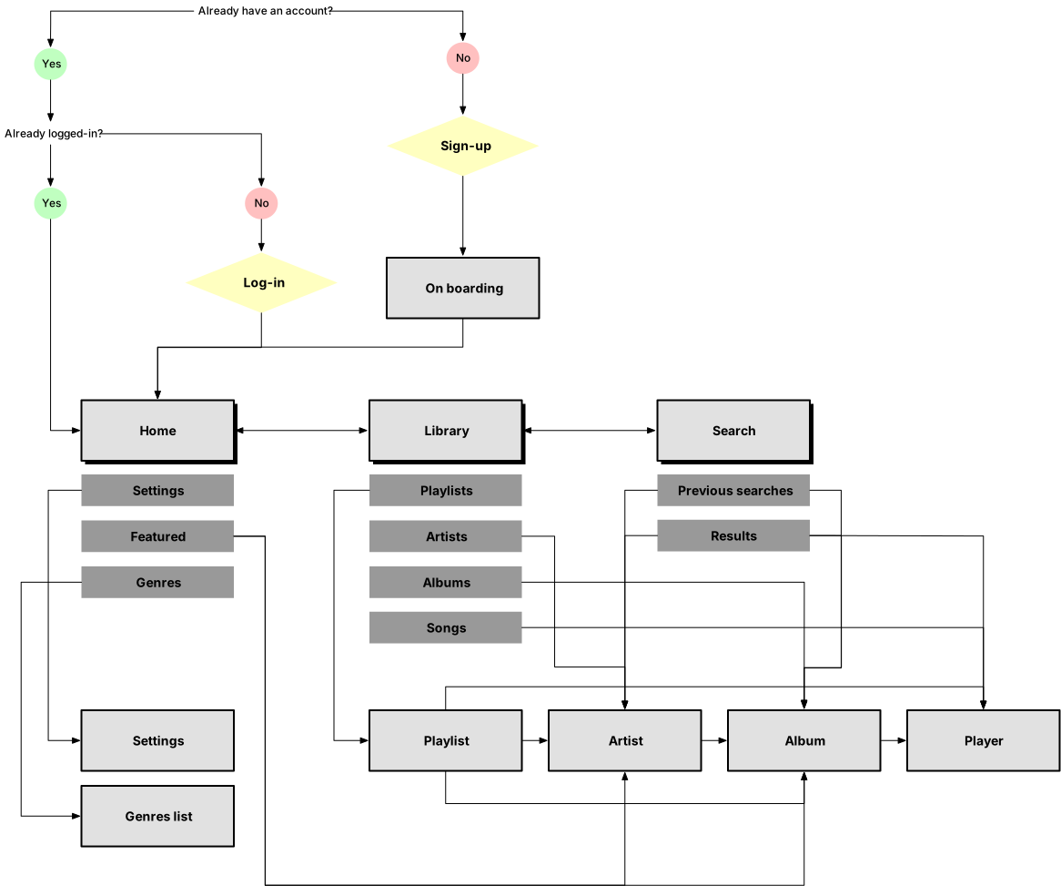
User flow

Sketches
The purpose of my sketches was to be able to explore my ideas and quickly iterate over them until finding a working layout from where start creating the mid-fidelity wireframes.
The purpose of my sketches was to be able to explore my ideas and quickly iterate over them until finding a working layout from where start creating the mid-fidelity wireframes.

Mid-fidelity wireframes
Color and style
The color palette was chosen to feel warm and approachable — but also a little bold. The tones draw inspiration from iconic amplifier brands like Orange and Marshall, bringing a vintage, rebellious edge that reflects the spirit of the app. Beyond aesthetics, the high-contrast palette also serves a practical purpose: making key actions instantly recognizable and easy to act on.

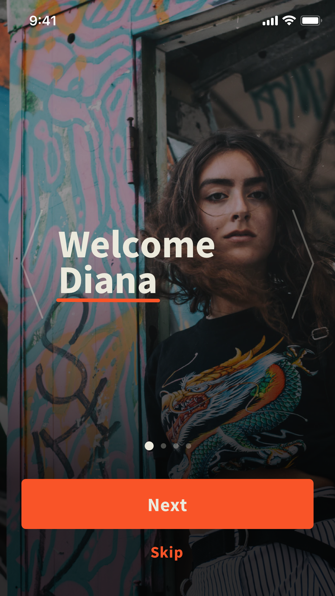

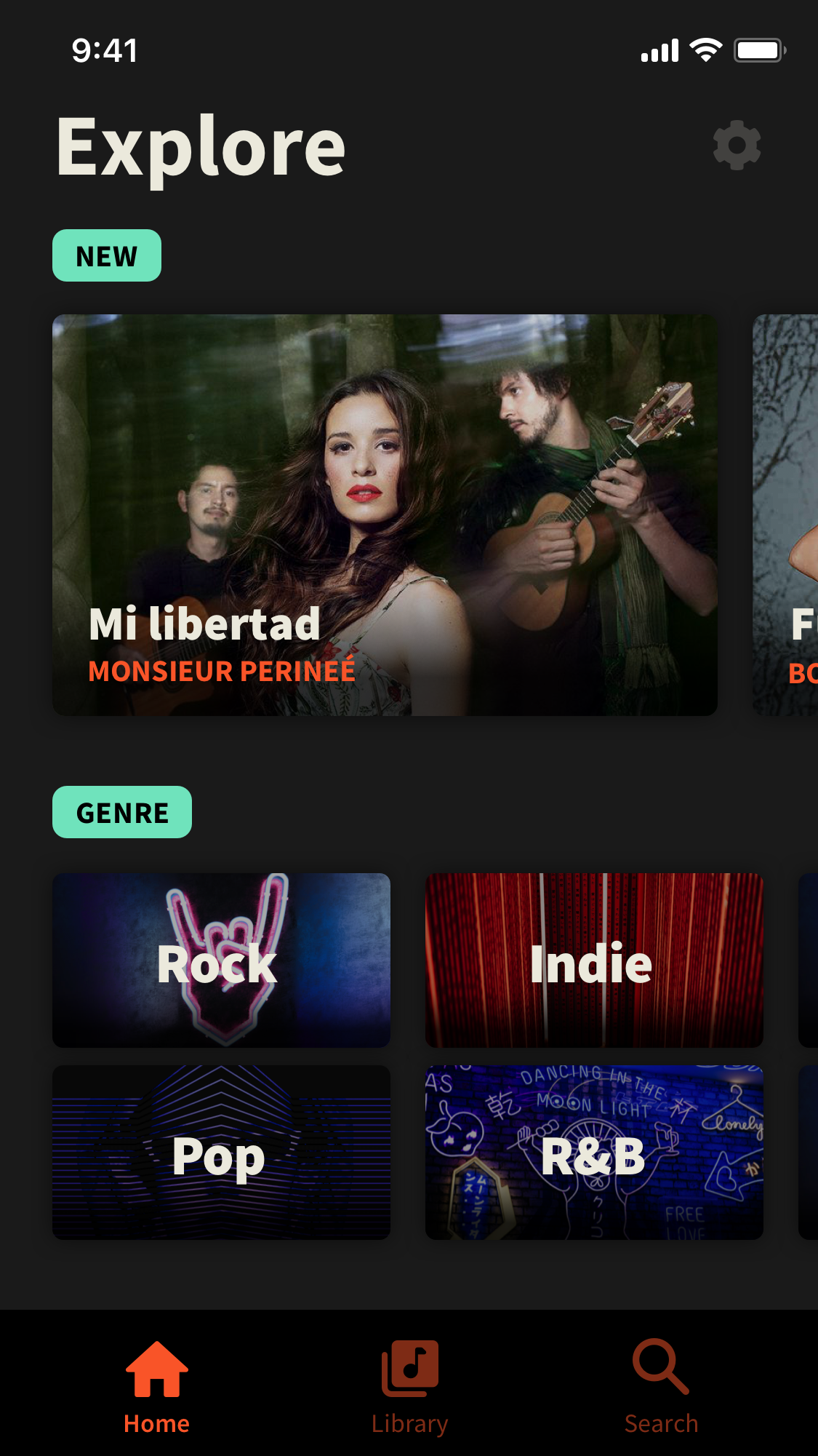


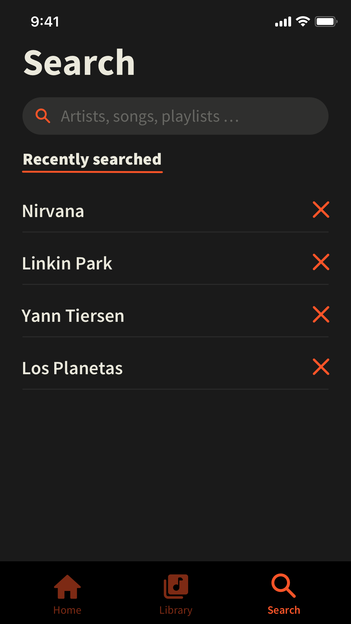

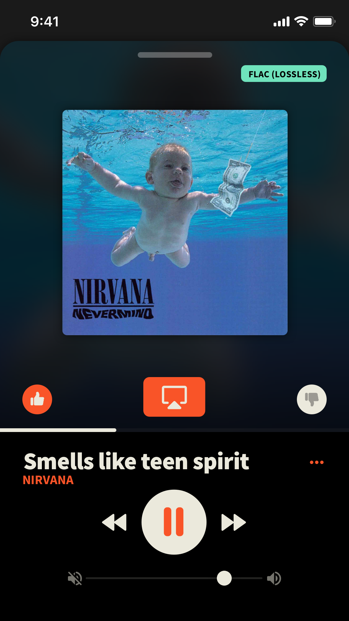
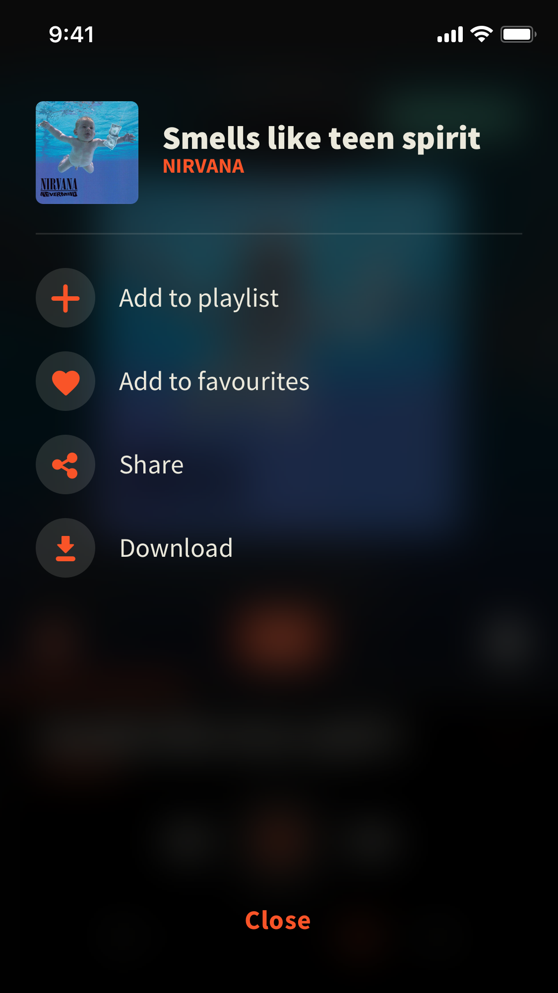
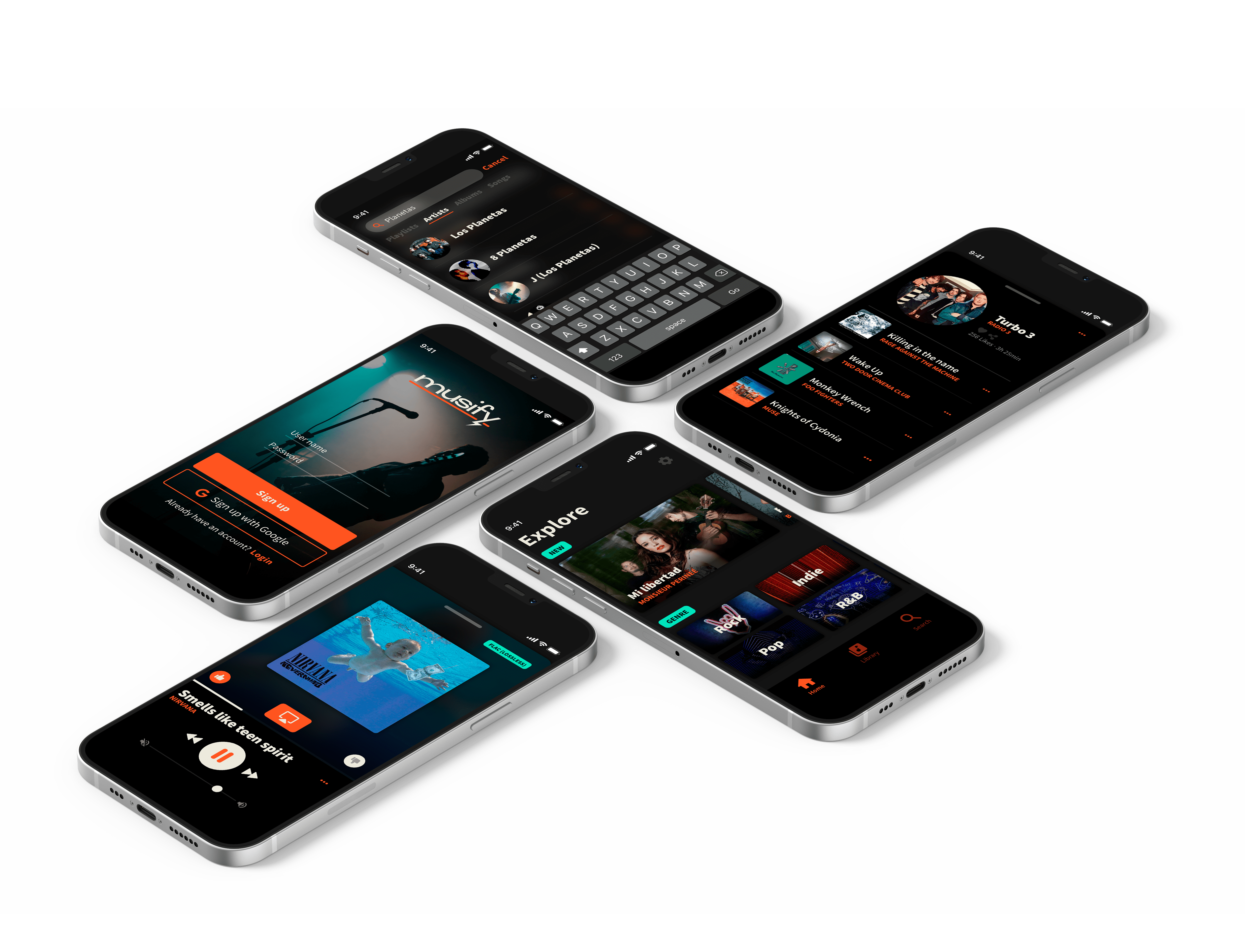
Hi-def screens
© Made with ♥︎ in Berlin by Juan Ossorio Lopez — 2025
© Made with ♥︎ in Berlin by Juan Ossorio López — 2025