FindMeAGig! app
FindMeAGig! app
FindMeAGig! app
FindMeAGig! app
Find Me A Gig! is a concept app for discovering live music and cultural events — concerts, theatre, film screenings — near you, with end-to-end booking in one place.
#uxdesign #uidesign
Description
Description
While apps like Facebook Local cover events broadly, there was a clear gap in the market: no single platform focused on live cultural experiences — concerts, theatre, film screenings — with a streamlined, end-to-end booking flow. Find Me A Gig! was designed to fill that gap, giving users a dedicated space to discover what’s happening near them and buy tickets without ever leaving the app.
Role
Role
I owned the full UX process: competitive research, user interviews, user flow definition, wireframing, and final high-fidelity mockups with an interactive prototype.
Competitive research
I started the design process by researching about direct competitors.
I decided to analyse Quandoo and Facebook Local, and this are my key findings:
I started the design process by researching about direct competitors.
I decided to analyse Quandoo and Facebook Local, and this are my key findings:
I started the design process by researching about direct competitors.
I decided to analyse Quandoo and Facebook Local, and this are my key findings:

Quandoo
Competitive Analysis
KEY OBJECTIVES
Claim: “Discover and book the best restaurants.”
Tagline: “Reserve a table for free. 244,036,347 seated diners already have.”
About: “As the fastest-growing restaurant reservation platform globally, Quandoo connects diners with the best restaurants around the world via a table reservation system that’s smart and always personalised. Quandoo is a convenient way for diners to discover new places to eat, book tables online, get exclusive deals and offers and review their experience afterwards. Founded in 2012, over 50 million diners already make up the Quandoo community of online restaurant booking and enjoy more fun and more time when they eat out. From local favourites to Michelin stars, book a restaurant online today.”
OVERALL STRATEGY
A quick search in Google reveals the company’s website, social media profiles and its profile in company review sites and job search portals such as Crunchbase, Kununu, or Connecticum.
In addition on the first page of the search results one can find the iOS and Android app stores links.
It’s rated more than 4,5 stars in both app stores, with more than 2.500 reviews in each, which reveals a very good impact on users.
MARKET ADVANTAGE
Quandoo seems to be one of the top 3 recommendation apps used in Berlin for booking a table.
They agreed in 2019 a deal with its main competitor, OpenTable, to allow their partner restaurants to be booked across both platforms.
Was founded in 2012, and acquired in 2015 by Recruit Holdings.
MARKETING PROFILE
Quandoo was founded in 2012 by Daniel P. Glasner, Ronny Lange, Philipp Magin, Sebastian Moser und Tim-Hendrik Meyer with the goal of making an intuitive product to connect restaurants and guests in an easy way.
UX Analysis
LAYOUT
The layout is good looking and well structured in a comprehensive and intuitive way. This leads to an interface that feels familiar and is easy to interact with.
NAVIGATION STRUCTURE
The navigation structure of its app is quite logic and intuitive. It has a main menu at the bottom, a pattern which feels very familiar to any user, and in addition to the search section there is also a search bar on the first screen of the app.
CALL TO ACTIONS (CTA'S)
The user is able to browse the app without signing up. There is a “check availability” floating button at the bottom of the restaurant’s profiles, making it easy and unobtrusive to navigate the app, and quickly make a reservation when needed.
Competitive Analysis
KEY OBJECTIVES
Claim: “Discover and book the best restaurants.”
Tagline: “Reserve a table for free. 244,036,347 seated diners already have.”
About: “As the fastest-growing restaurant reservation platform globally, Quandoo connects diners with the best restaurants around the world via a table reservation system that’s smart and always personalised. Quandoo is a convenient way for diners to discover new places to eat, book tables online, get exclusive deals and offers and review their experience afterwards. Founded in 2012, over 50 million diners already make up the Quandoo community of online restaurant booking and enjoy more fun and more time when they eat out. From local favourites to Michelin stars, book a restaurant online today.”
OVERALL STRATEGY
A quick search in Google reveals the company’s website, social media profiles and its profile in company review sites and job search portals such as Crunchbase, Kununu, or Connecticum.
In addition on the first page of the search results one can find the iOS and Android app stores links.
It’s rated more than 4,5 stars in both app stores, with more than 2.500 reviews in each, which reveals a very good impact on users.
MARKET ADVANTAGE
Quandoo seems to be one of the top 3 recommendation apps used in Berlin for booking a table.
They agreed in 2019 a deal with its main competitor, OpenTable, to allow their partner restaurants to be booked across both platforms.
Was founded in 2012, and acquired in 2015 by Recruit Holdings.
MARKETING PROFILE
Quandoo was founded in 2012 by Daniel P. Glasner, Ronny Lange, Philipp Magin, Sebastian Moser und Tim-Hendrik Meyer with the goal of making an intuitive product to connect restaurants and guests in an easy way.
UX Analysis
LAYOUT
The layout is good looking and well structured in a comprehensive and intuitive way. This leads to an interface that feels familiar and is easy to interact with.
NAVIGATION STRUCTURE
The navigation structure of its app is quite logic and intuitive. It has a main menu at the bottom, a pattern which feels very familiar to any user, and in addition to the search section there is also a search bar on the first screen of the app.
CALL TO ACTIONS (CTA'S)
The user is able to browse the app without signing up. There is a “check availability” floating button at the bottom of the restaurant’s profiles, making it easy and unobtrusive to navigate the app, and quickly make a reservation when needed.
Competitive Analysis
KEY OBJECTIVES
Claim: “Discover and book the best restaurants.”
Tagline: “Reserve a table for free. 244,036,347 seated diners already have.”
About: “As the fastest-growing restaurant reservation platform globally, Quandoo connects diners with the best restaurants around the world via a table reservation system that’s smart and always personalised. Quandoo is a convenient way for diners to discover new places to eat, book tables online, get exclusive deals and offers and review their experience afterwards. Founded in 2012, over 50 million diners already make up the Quandoo community of online restaurant booking and enjoy more fun and more time when they eat out. From local favourites to Michelin stars, book a restaurant online today.”
OVERALL STRATEGY
A quick search in Google reveals the company’s website, social media profiles and its profile in company review sites and job search portals such as Crunchbase, Kununu, or Connecticum.
In addition on the first page of the search results one can find the iOS and Android app stores links.
It’s rated more than 4,5 stars in both app stores, with more than 2.500 reviews in each, which reveals a very good impact on users.
MARKET ADVANTAGE
Quandoo seems to be one of the top 3 recommendation apps used in Berlin for booking a table.
They agreed in 2019 a deal with its main competitor, OpenTable, to allow their partner restaurants to be booked across both platforms.
Was founded in 2012, and acquired in 2015 by Recruit Holdings.
MARKETING PROFILE
Quandoo was founded in 2012 by Daniel P. Glasner, Ronny Lange, Philipp Magin, Sebastian Moser und Tim-Hendrik Meyer with the goal of making an intuitive product to connect restaurants and guests in an easy way.
UX Analysis
LAYOUT
The layout is good looking and well structured in a comprehensive and intuitive way. This leads to an interface that feels familiar and is easy to interact with.
NAVIGATION STRUCTURE
The navigation structure of its app is quite logic and intuitive. It has a main menu at the bottom, a pattern which feels very familiar to any user, and in addition to the search section there is also a search bar on the first screen of the app.
CALL TO ACTIONS (CTA'S)
The user is able to browse the app without signing up. There is a “check availability” floating button at the bottom of the restaurant’s profiles, making it easy and unobtrusive to navigate the app, and quickly make a reservation when needed.

Facebook Local
Competitive Analysis
KEY OBJECTIVES
Claim: “Discover places to go and events that will take place near you”
Tagline: “All thanks to the contributions of people you know and trust”
About: “Always be aware of what is happening around you - no matter where you are and whether you are planning activities for the weekend with friends or want to explore a new area.”
OVERALL STRATEGY
A quick search in Google reveals the app landing page, the links from the iOS and Android app stores, and a few articles in main tech media such as Techcrunch, Wired, The Verge…
There is no content in the landing page, just a link to download the app. These media articles are quite old, mostly from 3 years ago.
It’s rated 3,4 in the Apple Store, and 4 in the Google Play Store. Seems the general opinion of users is that is a good idea, but is confusing and missing functionalities.
MARKET ADVANTAGE
Facebook Local is backed by Facebook, which makes it a top competitor.
But in the other hand, seems that Facebook don’t put much interest on this app, which seems to be a kind of side project of the company.
It’s really interesting the integration with Facebook, which allows users to see their friends’ activities and suggestions.
MARKETING PROFILE
Facebook first launched the Events app, to help that friend who rallies everyone to go out and figure out where. It was a bit redundant with the main Facebook app’s event feature, and ruled out places that were fun every night rather than just when they threw parties.
Then Facebook created Local to help you pick between great bars on a block, and find out if one has a band playing.
UX Analysis
LAYOUT
The layout is good looking and and share some similarities with Facebook main UI.
The UI’s main components are a map and the events listed as cards.
NAVIGATION STRUCTURE
The navigation structure of the app is not so intuitive. It clearly evokes to Facebook, which might result familiar to the most of the users, but still lacking some common patterns, such as a navigation bar at the bottom.
CALL TO ACTIONS (CTA'S)
CTAs are also based in Facebook look and feel, which makes them easy to recognise, but at the same time they don’t “pop-up” enough and are easy to mistake with other buttons.
Competitive Analysis
KEY OBJECTIVES
Claim: “Discover places to go and events that will take place near you”
Tagline: “All thanks to the contributions of people you know and trust”
About: “Always be aware of what is happening around you - no matter where you are and whether you are planning activities for the weekend with friends or want to explore a new area.”
OVERALL STRATEGY
A quick search in Google reveals the app landing page, the links from the iOS and Android app stores, and a few articles in main tech media such as Techcrunch, Wired, The Verge…
There is no content in the landing page, just a link to download the app. These media articles are quite old, mostly from 3 years ago.
It’s rated 3,4 in the Apple Store, and 4 in the Google Play Store. Seems the general opinion of users is that is a good idea, but is confusing and missing functionalities.
MARKET ADVANTAGE
Facebook Local is backed by Facebook, which makes it a top competitor.
But in the other hand, seems that Facebook don’t put much interest on this app, which seems to be a kind of side project of the company.
It’s really interesting the integration with Facebook, which allows users to see their friends’ activities and suggestions.
MARKETING PROFILE
Facebook first launched the Events app, to help that friend who rallies everyone to go out and figure out where. It was a bit redundant with the main Facebook app’s event feature, and ruled out places that were fun every night rather than just when they threw parties.
Then Facebook created Local to help you pick between great bars on a block, and find out if one has a band playing.
UX Analysis
LAYOUT
The layout is good looking and and share some similarities with Facebook main UI.
The UI’s main components are a map and the events listed as cards.
NAVIGATION STRUCTURE
The navigation structure of the app is not so intuitive. It clearly evokes to Facebook, which might result familiar to the most of the users, but still lacking some common patterns, such as a navigation bar at the bottom.
CALL TO ACTIONS (CTA'S)
CTAs are also based in Facebook look and feel, which makes them easy to recognise, but at the same time they don’t “pop-up” enough and are easy to mistake with other buttons.
Competitive Analysis
KEY OBJECTIVES
Claim: “Discover places to go and events that will take place near you”
Tagline: “All thanks to the contributions of people you know and trust”
About: “Always be aware of what is happening around you - no matter where you are and whether you are planning activities for the weekend with friends or want to explore a new area.”
OVERALL STRATEGY
A quick search in Google reveals the app landing page, the links from the iOS and Android app stores, and a few articles in main tech media such as Techcrunch, Wired, The Verge…
There is no content in the landing page, just a link to download the app. These media articles are quite old, mostly from 3 years ago.
It’s rated 3,4 in the Apple Store, and 4 in the Google Play Store. Seems the general opinion of users is that is a good idea, but is confusing and missing functionalities.
MARKET ADVANTAGE
Facebook Local is backed by Facebook, which makes it a top competitor.
But in the other hand, seems that Facebook don’t put much interest on this app, which seems to be a kind of side project of the company.
It’s really interesting the integration with Facebook, which allows users to see their friends’ activities and suggestions.
MARKETING PROFILE
Facebook first launched the Events app, to help that friend who rallies everyone to go out and figure out where. It was a bit redundant with the main Facebook app’s event feature, and ruled out places that were fun every night rather than just when they threw parties.
Then Facebook created Local to help you pick between great bars on a block, and find out if one has a band playing.
UX Analysis
LAYOUT
The layout is good looking and and share some similarities with Facebook main UI.
The UI’s main components are a map and the events listed as cards.
NAVIGATION STRUCTURE
The navigation structure of the app is not so intuitive. It clearly evokes to Facebook, which might result familiar to the most of the users, but still lacking some common patterns, such as a navigation bar at the bottom.
CALL TO ACTIONS (CTA'S)
CTAs are also based in Facebook look and feel, which makes them easy to recognise, but at the same time they don’t “pop-up” enough and are easy to mistake with other buttons.
Competitive research
Beyond competitor analysis, I ran user research using the Research Learning Spiral framework to validate my assumptions. I interviewed potential users to understand their pain points and discovered that most people rely on Facebook or Songkick for event discovery, but they found these platforms cluttered and not specifically designed for cultural experiences. This confirmed my market opportunity.
I made some user research through the RESEARCH LEARNING SPIRAL.
I defined the objectives of my research by figuring out the answers to these questions: Who-What-When-Where-Why-How.
And wrote my hypothesis:
1. Existing apps such as Facebook Local are not intuitive enough, so aren’t easy to understand
2. People are normally not inform of all the gigs and events going on where they are
3. It’s easy to loose the track of upcoming events in which you are interested
4. Would be great to find events and buy tickets for them (when needed) all in the same app
I conducted interviews to potential users, and synthesise all my findings:
I made some user research through the RESEARCH LEARNING SPIRAL.
I defined the objectives of my research by figuring out the answers to these questions: Who-What-When-Where-Why-How.
And wrote my hypothesis:
1. Existing apps such as Facebook Local are not intuitive enough, so aren’t easy to understand
2. People are normally not inform of all the gigs and events going on where they are
3. It’s easy to loose the track of upcoming events in which you are interested
4. Would be great to find events and buy tickets for them (when needed) all in the same app
I conducted interviews to potential users, and synthesise all my findings:


User personas

User flow

Sketches
The purpose of my sketches was to be able to explore my ideas and quickly iterate over them until finding an working layout from where start creating the mid-fidelity wireframes.
The purpose of my sketches was to be able to explore my ideas and quickly iterate over them until finding a working layout from where start creating the mid-fidelity wireframes.

Mid-fidelity wireframes
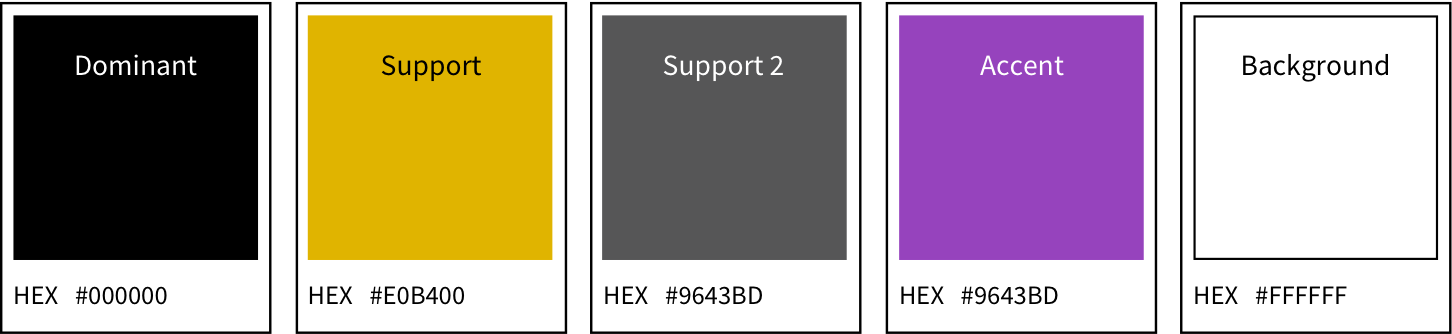
Color and style
At this stage I defined a simple style guide to establish typographic hierarchy and button states—ensuring visual consistency across the entire app.


© Made with ♥︎ in Berlin by Juan Ossorio Lopez — 2025
© Made with ♥︎ in Berlin by Juan Ossorio López — 2025